

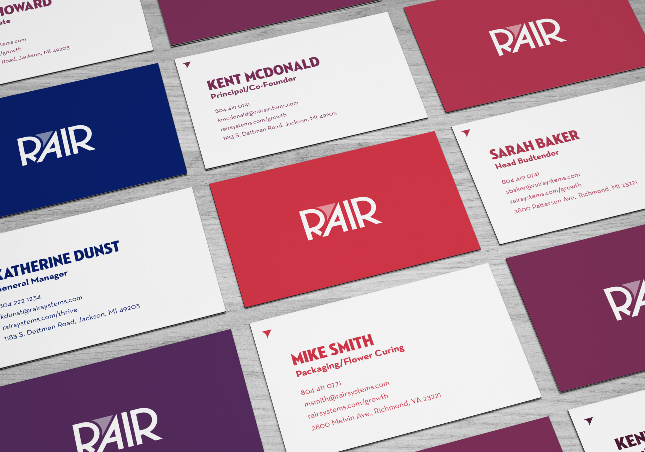
Rair Systems is an aeroponic cannabis grower/dispensary. They tasked our agency (DP+) to develop a brand from the ground up. My team worked on naming, logo design, identity system, brand voice, and packaging.
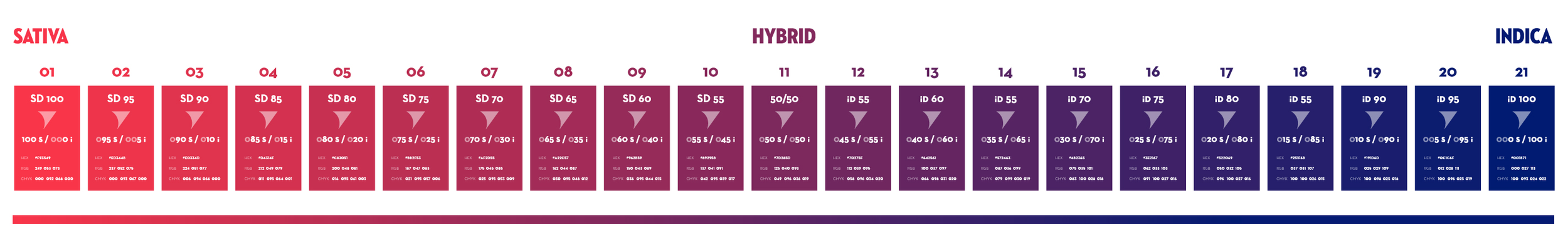
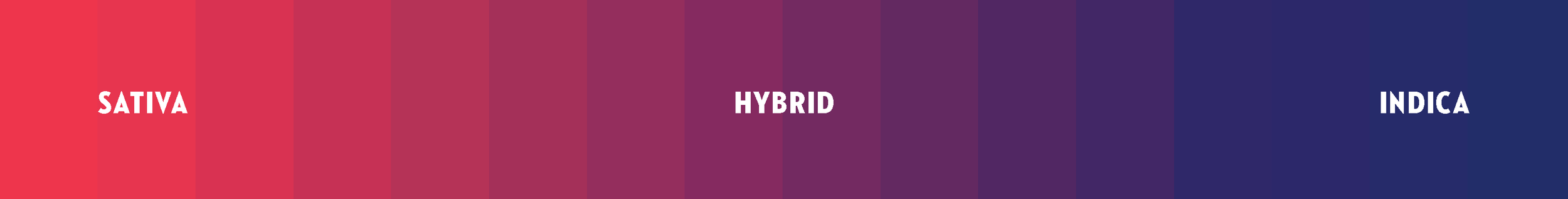
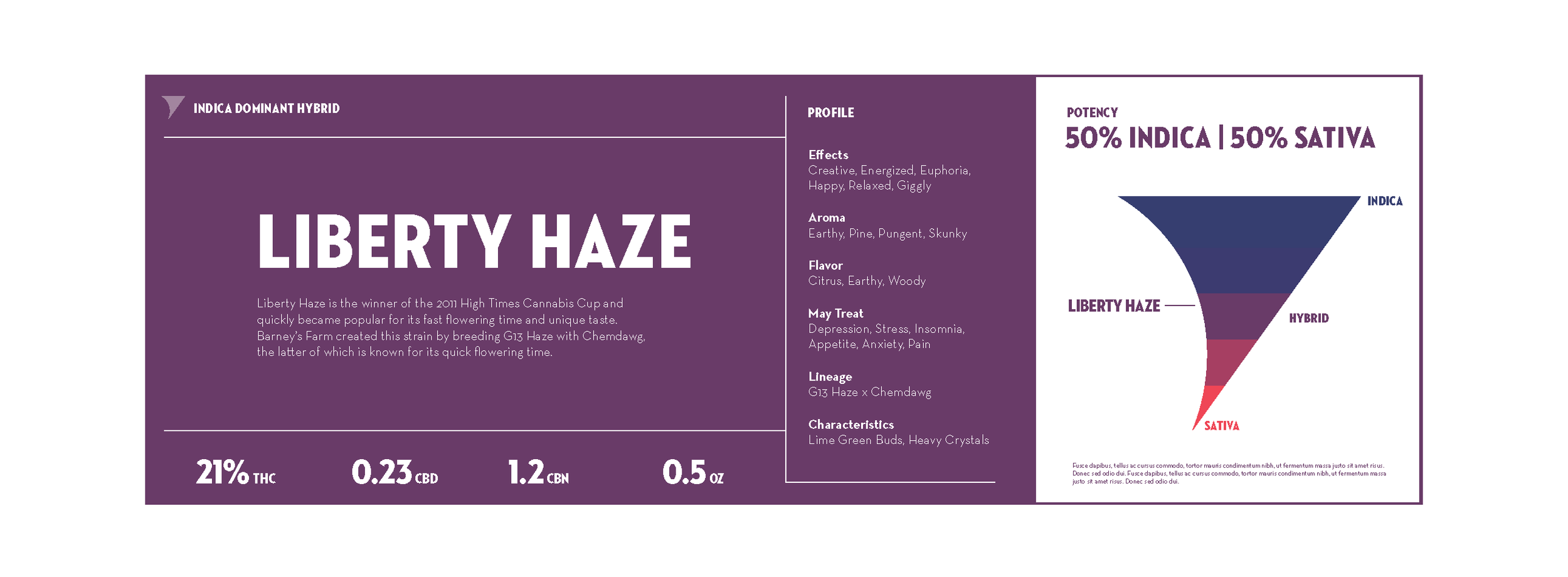
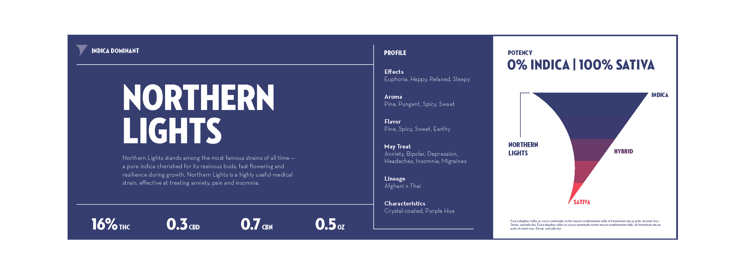
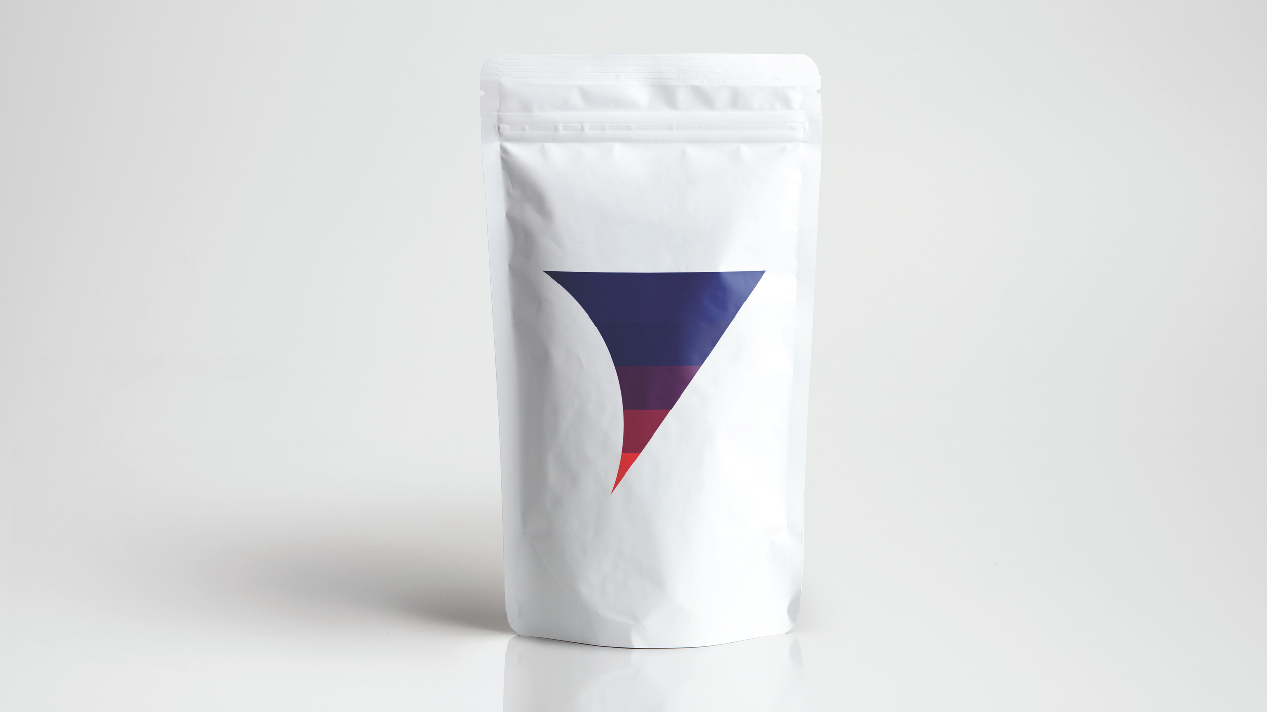
The goal while working on this mark was to come up with a solution that felt sleek and fun. The type is a hand drawn geometric sans-serif typeface inspired by the typeface Neutraface. The triangular icon represents plant roots growing aeroponically. The color gradient represents the color theory that describes the strain (Sativa, Hybrid, Indica).
With a gradient scale, we can use color to indicate the varying levels of indica and sativa present in a given strain. For example, blue would indicate a strain has strong indica-dominance, while red, which is on the opposite end of the spectrum, would indicate that a strain has strong sativa-dominance.
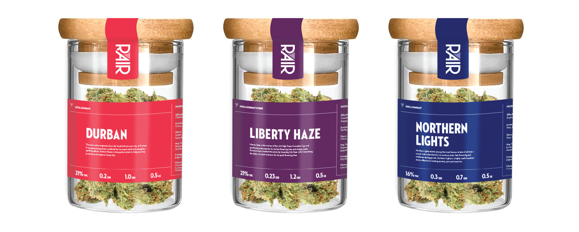
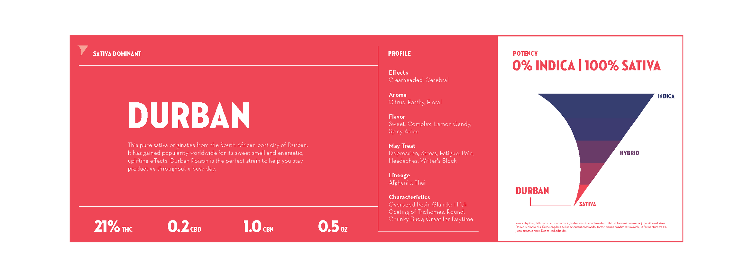
We worked to make the packaging accessible and easy to identify. We wanted the label to be clear and help the consumer pick out their favorite strain quickly and easily based on the color scale.
Each employee gets to pick their business card color based where their preference falls on the color scale.